Setting Up Your First Site
Workflow Tips for The SEO Design Framework
 Setting Up Your First Website
So, you've installed the Framework, now what? These are the steps we use when constructing a new website with the SEO Design Framework.
Below, we've outlined a typical workflow process that covers basic settings, presentational styles and configuration options for the Global Settings, including Header, Content, Layout, Widgets and Footer.
The selections with an * will be covered in their own respective help topics as they are more involved beyond the scope of the basic parameters of setting up your website. However, we will cover topics 1,4,5,6 and 7 below in detail.
1) Main Global Settings Tabs
2) Silo (The SDF Silo Builder Feature) *
3) SEO (SEO Ultimate Settings Render Here) *
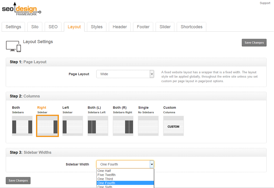
4) Layout (Set Global Layout for Content and Widgets Here)
5) Styles (Control the Frontend Presentational Styles for All Features, Typography, Widgets, Header, Content Areas and Footer).
6) Header (Set up Logo, Header and Header Structure as well as add scripts for SDF Global)
7) Footer (Set up Footer and Below Footer Area and Add Scripts here for SDF Global)
8) Slider (Configure Revolution Slider settings Here) *
9) Shortcodes *
The Workflow Plan is to:
After you're finished, your ready to either create new pages / posts or style your existing content to compliment your design.
As a preface, we'd like to cover two distinct settings types inside the SEO Design Framework. The Framework features
Global and
Local Page Settings. Global Settings are the sidewide defaults and
Local Page Settings are mirrored at the page level and allow you to toggle features and / or override the global defaults.
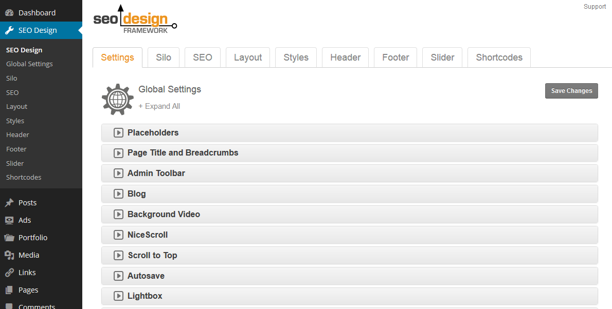
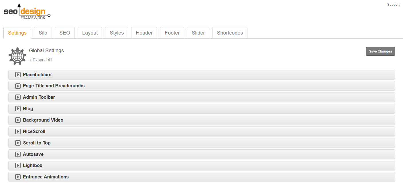
You'll find the global controls housed under the Global Settings Menu which is located under SEO Design on the top left navigation menu of your WordPress dashboard. Once you click into the Global Settings you will observe a series of horizontal tabs.
Each tab contains additional controls inside the chevrons that pertain to the main global setting above it allowing you to toggle or customize the nested features. You can expand all chevrons (and sub settings) simultaneously using the "Expand All" link at the top or you can open the chevrons individually as needed to make adjustments to each setting.
Start here and progress through each of the Global Settings. After you customize your global defaults and save changes, you're ready to create pages, posts and/or style existing content.
How Global Settings Work
When a new page or post is created, they inherit the Global Settings by default. Also, by making any changes to Global Settings those changes dynamically update all pages or posts set to global. For example, if I've selected the right sidebar as a global preset under - SEO Design > Layout > any new pages or posts or any page or post set to "Global" will reflect those settings.
The Page Level Settings (under the native WordPress page / post editor) allow you to override the Global Settings for that page or post. So, if you want to customize a page (e.g. toggle features on or off) such as the page title, header structure, breadcrumbs, navigation, etc., then use the Page Level Settings to customize the look of the front end.
How Local Page Settings Work
The Local Page Settings allow you to simply toggle features on / off as you need them to customize things like the display title, the layout and sidebars, the header, the footer, add HTML and scripts, custom navigation, breadcrumbs and more. To determine which settings are active, the Local Page Settings features highlighted gray buttons to indicate the Global / On or Off position. You can either turn a feature off Globally and then selectively toggle it on in the Local Page Settings or turn it on Globally and toggle it off at the page level.
The Global / Local page functionality is one powerful feature that separates the SEO Design Framework from other frameworks or premium themes. Once familiar with how it works, you'll possess unparalleled design flexibility.
Now that we've covered how the
Global and Local Page Settings work, it's time to learn by example and build your first website.
1. After the framework is installed...
2. Proceed to SEO Design > Global Settings and refine your global site wide options (follow the steps below).
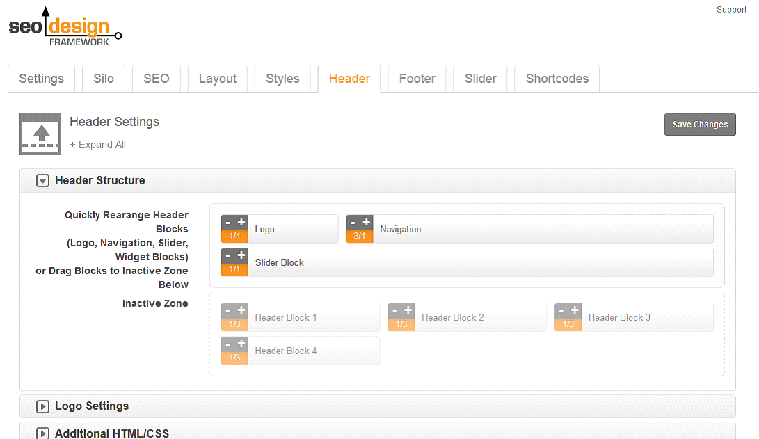
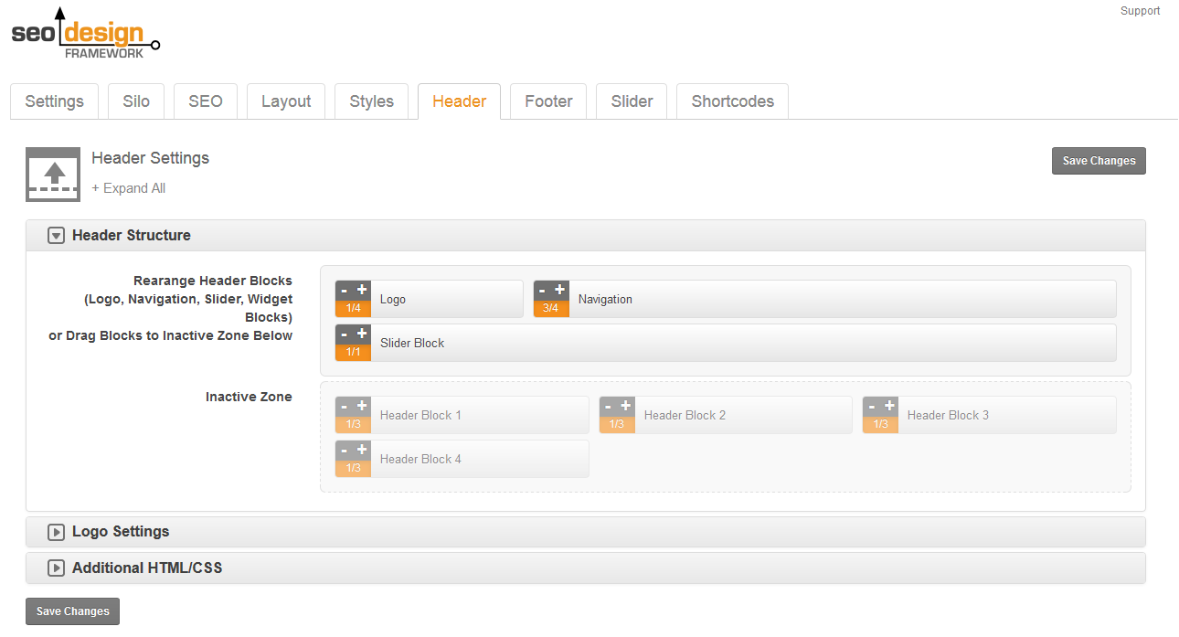
a. Set up your global header under SEO Design > Header > Header Structure (you can upload your logo and rearrange /build your header structure using + or – on the drag able sections).
Click the save changes button and the Global Header Structure will now be reflected dynamically on all pages that pull from the
Global Settings, you can style the individual header sections in SEO Design > Styles> afterward to customize each blocks look and feel.
For example, in the Header Structure Section, if you wanted the navigation for your website to take up a full row, or wanted to add another row under the logo and navigation area or add widgets for social media icons or anything else, you would do that here in the SEO Design > Header > Header Structure Section. Use + or – to add more or subtract widths for each section. You can also drag areas you don't need into the Inactive Zone.
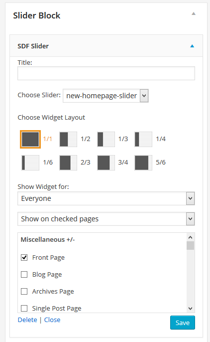
Hypothetically, if you wanted to use the slider, first you'll need to make sure it's active and then determine where it renders in the header (using the header structure) and then use the Slider Tab (in Global Settings) to create your slider and the SDF Slider Widget (Appearance > Widgets) and drag it into the Slider Block Widget area to enable the slider on pages or posts.
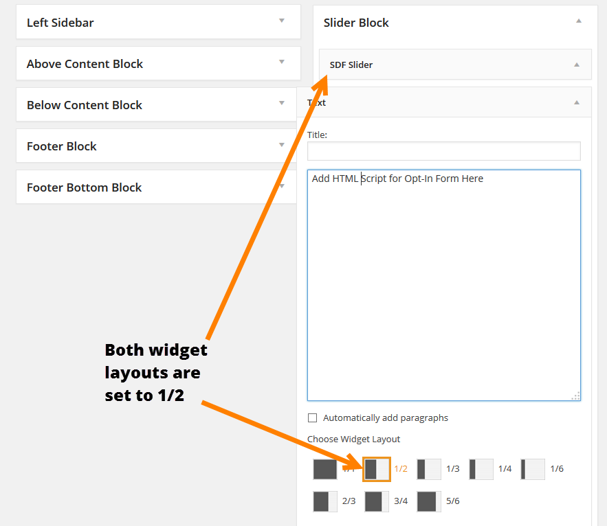
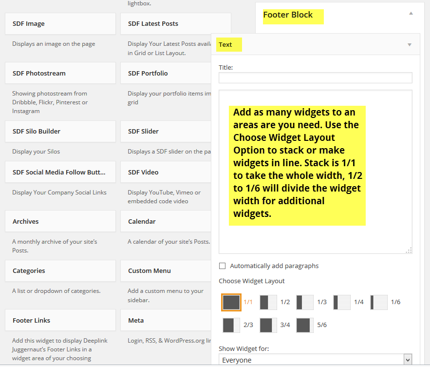
You can also add additional widgets, text or media to the slider block (since it's a widget area) by using the Widget Layout option in the Slider Block Widget. So, hypothetically if I wanted to add a slider on the left of the slider block and an opt-in on the right side, I would use the 1/2 | 1/2 widget layout for each of the widgets (1) the SDF Slider Widget and (2) the text widget for shortcodes and the opt in form.
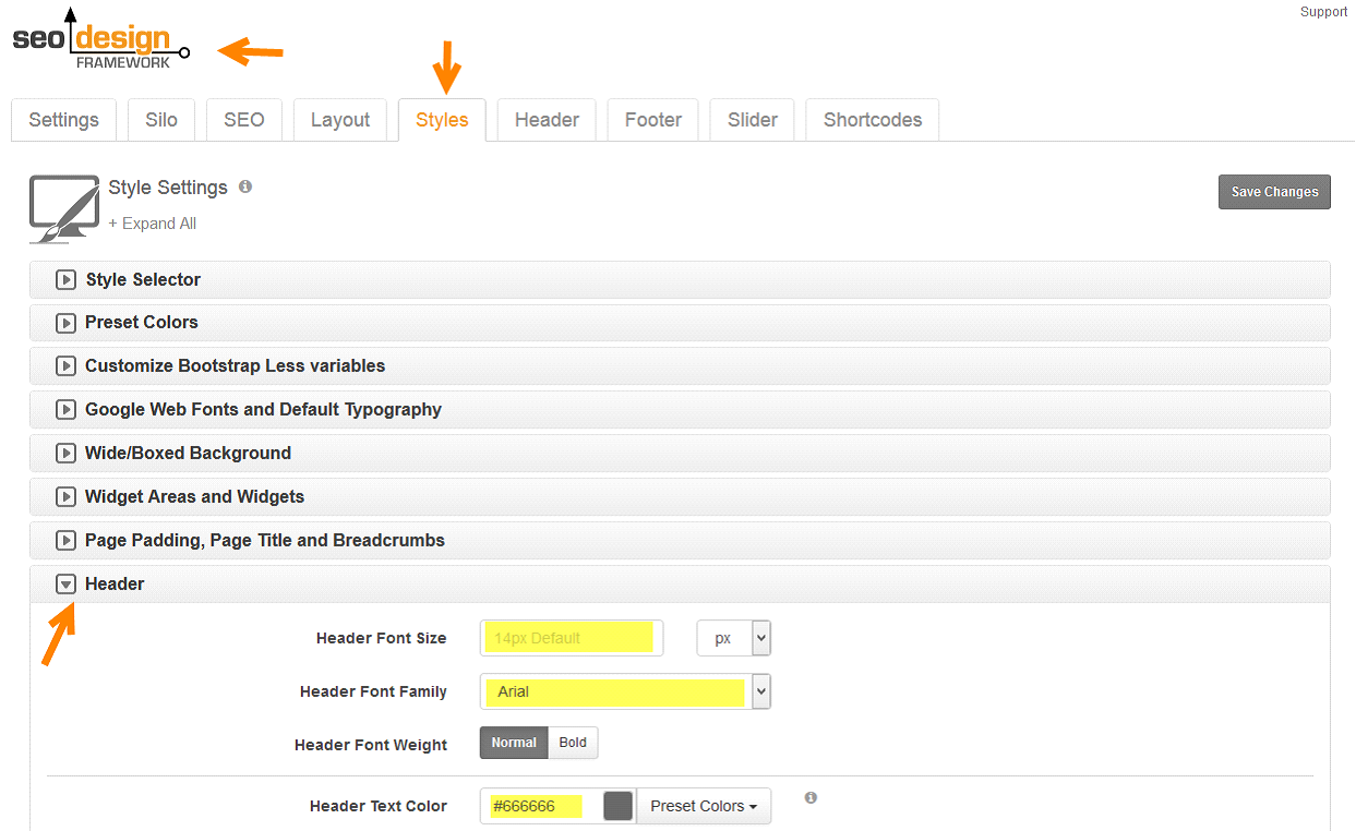
We have conveniently separated the website structure and design, all design styles and effects can be found Under SEO Design > Styles you can add effect such as parallax, background images, background colors, gradients, box shadows and more to customize the header and header block areas 1, 2, 3 and 4. In the Styles section you can also customize typography for each section, Title, Subtitle, Breadcrumbs, Header Widgets, Widgets in Footer and more.
Alternatively, you can modify the header widgets visual behavior under Appearance > Widgets > and combine or stack up to 6 widgets horizontally in one section. You can also implement Display Widget hide on / show on functionality so that widgets used in the header blocks are either visible or hidden on specific pages, posts or categories.
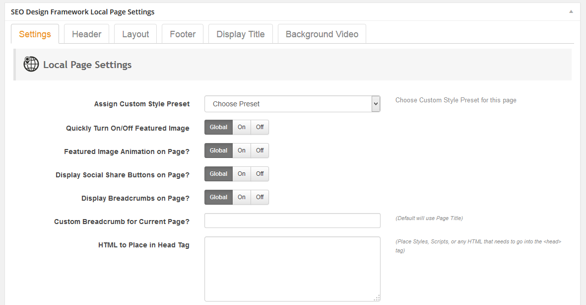
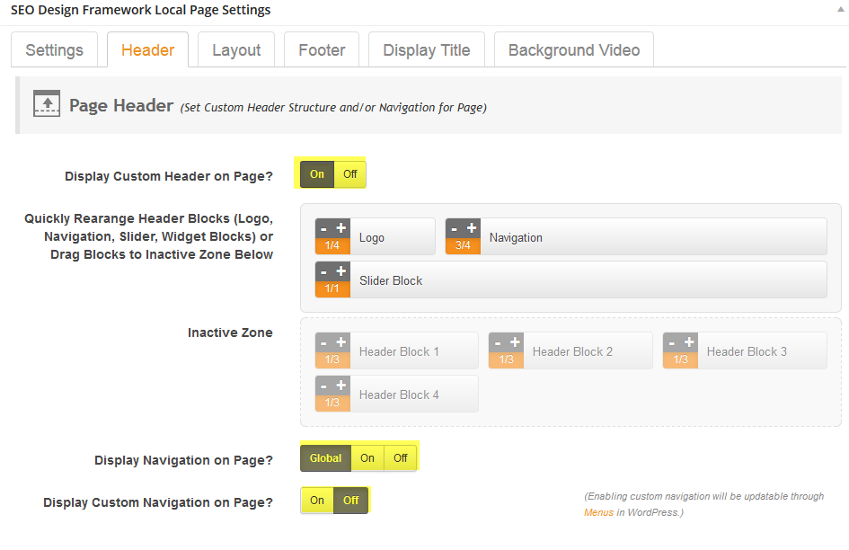
Also, once your Global Settings are configured, you can conveniently modify the header structure of each page or post under in the Local Page Settings. This allows you to easily override global presets or customize each page based on design requirements. Highlighted examples in the image below show how options such as the custom header, navigation and page structure toggle options are available under each respective tab (main settings, header, layout, footer, display title and background video).
Advanced User Tip: The
Local Page Settings allow you to simply toggle functions on /off or customize features on a page by page basis and are particularly useful if 1) you have certain widgets that have specific items in them i.e. like using Header Widget 3 and 4 for an opt-in form, call to click, social media icons or any other functional widget or 2) if you want to remove default/global header functionality from a specific page or simply rearrange how each header block appears on the page.
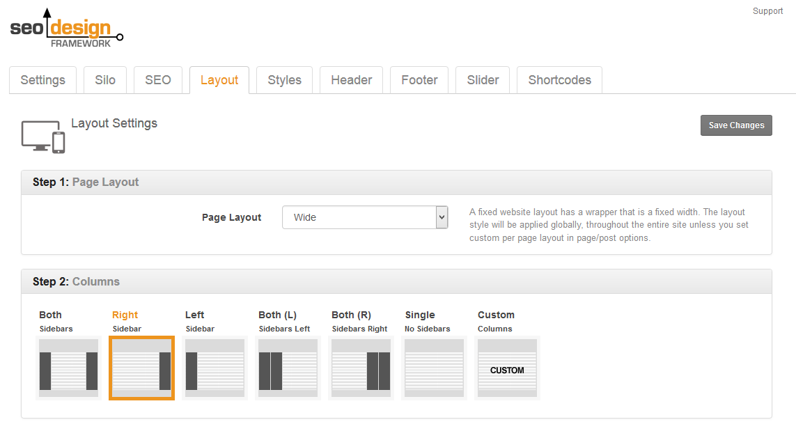
b. Next, set up your layout and sidebar options under SEO Design > Layout (based on the project / design).
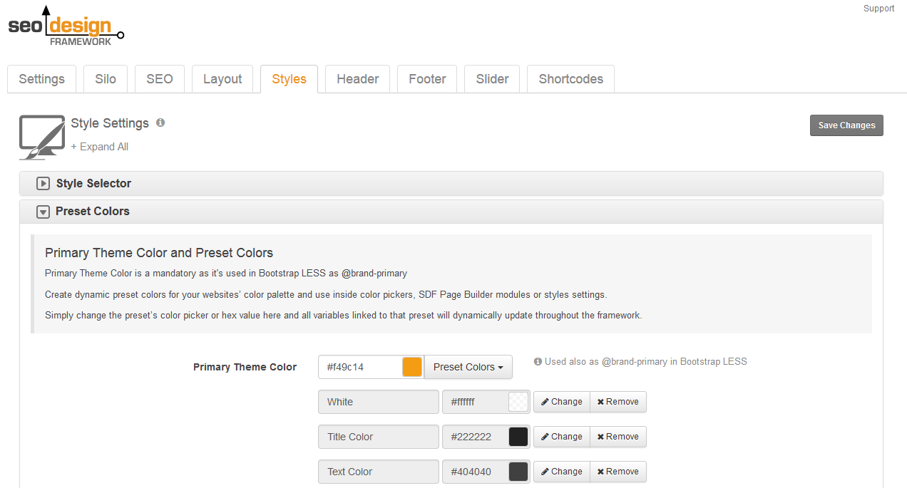
c. Next, rather than just using hex values inside input fields under the Styles tab, add all of your Preset Colors (hex colors required for the design) first, under SEO Design > Preset Colors >. As a result, instead of having to go back and update variables one by one, all of your design settings, fonts, and styles will dynamically update when you change a preset from this region.
Advanced Design Tip: Using Primary theme and color presets will save you lots of time designing a consistent user experience for your website. For example, if you change the
Primary Theme Color, under
SEO Design > Styles > Color Presets > then all the colors tied to that dynamic field are updated instantly. So, if my primary theme color is orange and I changed it to blue, then my navigation active states, titles, and widget areas would reflect that with one simple modification.
In another tutorial, I will show you how to use presets in tandem with the style / appearance / skin selector above it so you can clone your styles and add them to your designs. However for now, let's cover the presets and how they work.
Color presets work like a virtual style sheet for hex colors that you can apply to any variable in this section or throughout the framework. You can create, update or rename your presets with appropriate naming conventions of how you intend to use them e.g. Header Background Color, Navigation Font, Main Text, etc. or simply colors to keep it simple e.g. charcoal, orange, etc.
Creating and assigning color pickers will save you time customizing the presentational layer of the front end since you'll have the option to either use a color picker (including RGB levels/opacity) or color presets for design inputs e.g. typography, widgets and other Global and Local Page Settings. Another advantage is when you update a color preset, it dynamically updates everywhere that value was used.
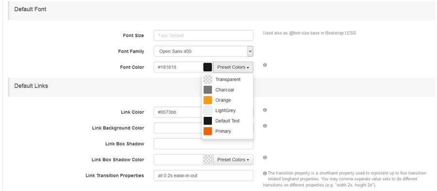
Once you've added all the color / hex values and named your presets, then progress down the additional tabs in the styles section and style everything from your typography (default font sizes, H1-H6 font family, font color, font size, breadcrumb color, font, size, widget title and text area justification, font color, size, widget background color, borders, border radius, shadow boxes) and all widgets so they all reflect the design implemented.
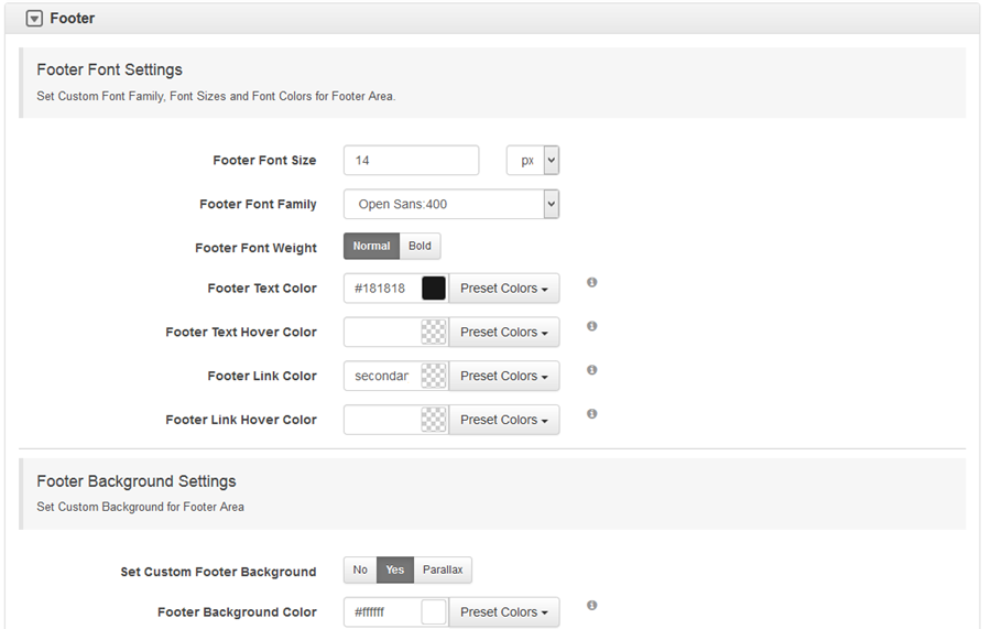
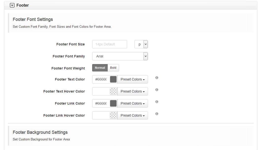
d. After that, style your footer background & typography options in SEO Design > Styles > Footer
and use Appearance > Widgets > to create the widget layout and footer structure.
For example, if I add 3 widgets to the footer inside of Appearance > Footer> and set the Widget Layout to 1/3 1/3 1/3 on each widget I add, this will create 3 widgets in the footer (horizontal to each other in the footer in the order they were entered).
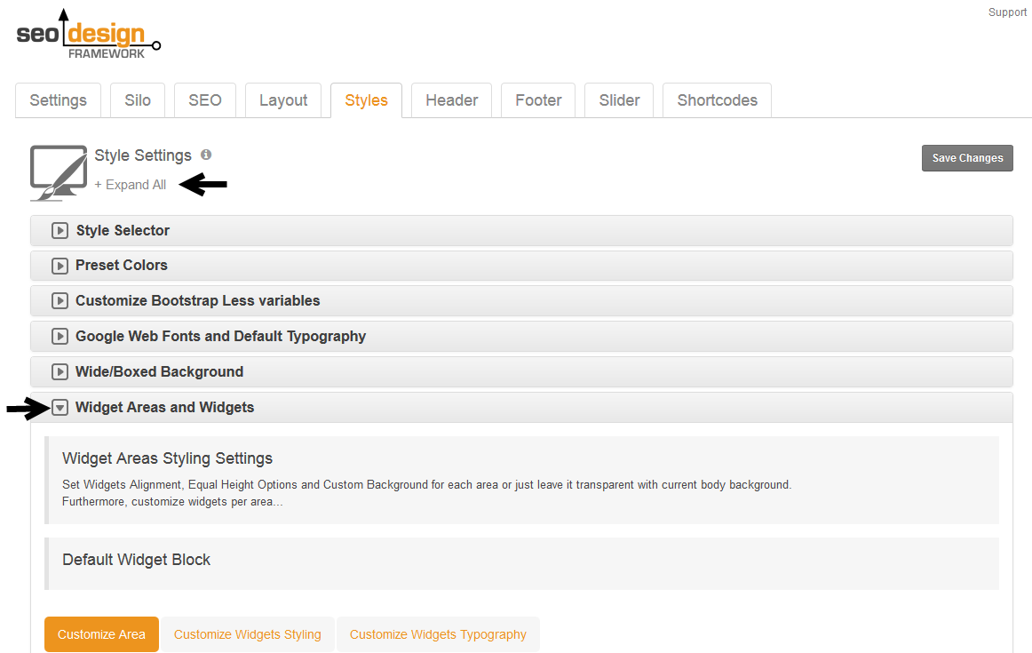
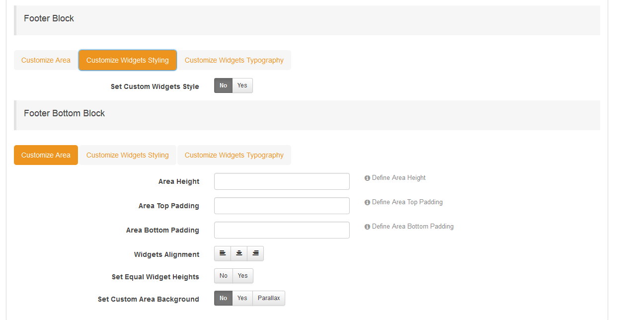
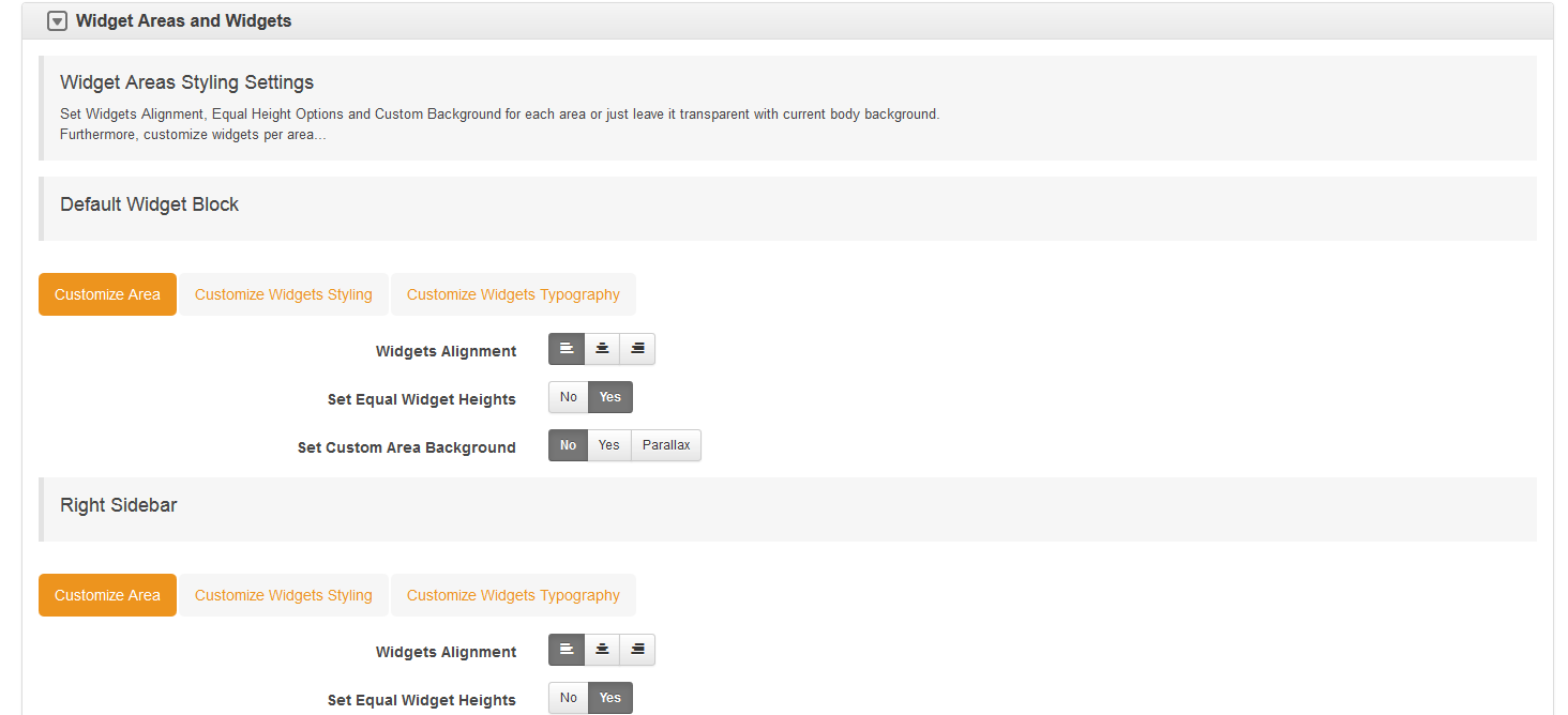
You can also use set equal height option under SEO Design > Styles > Widget Areas and Widgets > chevron to ensure that each widget maintains equal height in relation to widgets around it. *Just make sure Set Equal Widget Heights is set to "Yes".
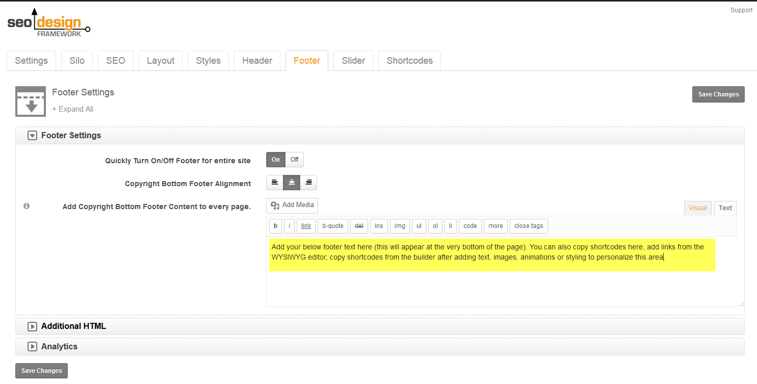
To add content of media to the "Bottom Footer Area" (the very bottom of the page) use SEO Design > Footer > WP Editor visual or text mode (for HTML).
To add additional HTML scripts, use the Additional HTML chevron (in the header or footer) and in the content footer area, you can add media or shortcodes and then style the Bottom Footer Content section under SEO Design > Styles > Footer Tab >. To customize this section (i.e. background color, font size, area height, parallax, add a radius, etc. use the SEO Design > Styles > Footer controls.
Alternative ways to set up the footer. Alternatively, if using widgets and the widget layout seems too complicated, you can use the
SDF Page Builder for
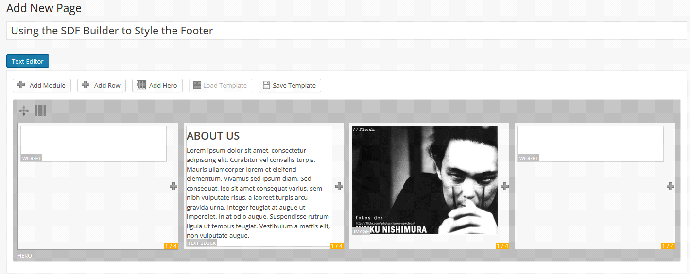
creating drag and drop structures that can be used in the header, footer or widget areas with ease. Start with a draft or dummy page and then use the SDF Builder Modules to add the images, text, videos, widgets or media. Here's how to built it.
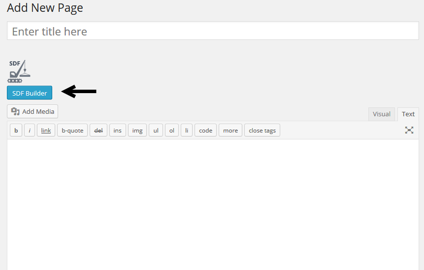
First >>> Proceed to a Page or Post and Click the SDF Builder Button.
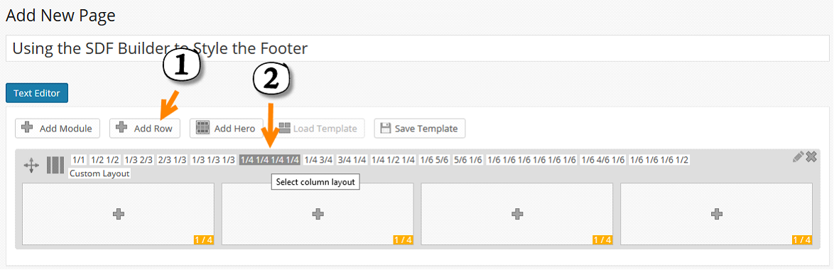
Next >>> Add a Row or Hero section and select the column widths for the layout.
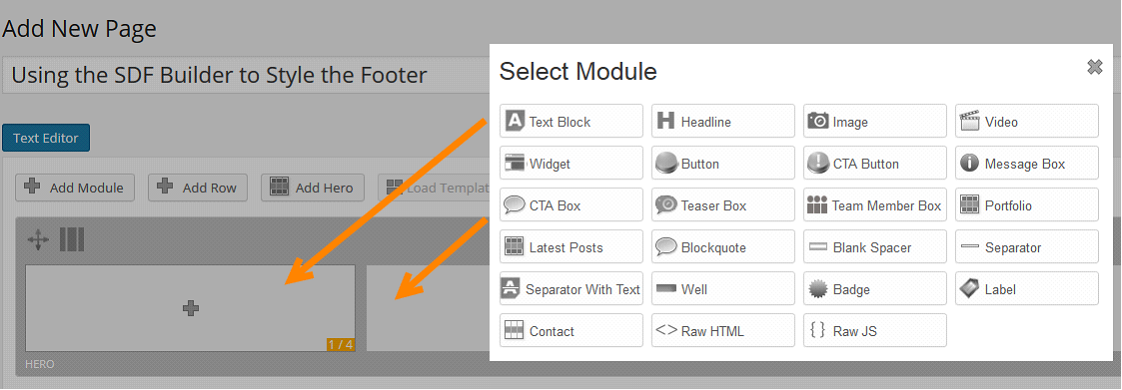
Next >>> Add modules to the SDF Page Builder such as widgets, videos, social media icons, a portfolio or Flikr widgets, contact forms or any other SDF Widgets with the SDF Widget Module or any of the SDF Builder Modules.
Next >>> Add the media elements you want to the columns with the SDF builder or widget functionality.
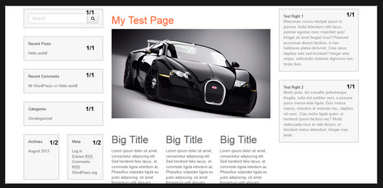
In this example I used a 1/4 1/4 1/4 1/4 column layout and added a widget to the first column, a text module to the second, an image module to the third and another widget to the fourth column. You can determine which widgets are displayed from a dropdown in the SDF Builder (or even create unlimited custom widgets) in Appearance > Widgets > Custom Widgets > and use them specifically inside the SDF Builder anytime you like.
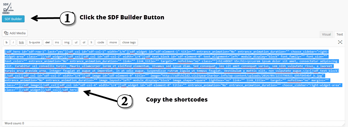
Next >>> Click SDF Builder Button again, then copy the shortcode.
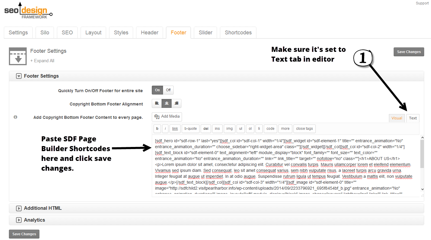
Next >>> Just paste the shortcode into the WP editor into the Footer Bottom WP Editor under the SEO Design > Footer > Text Editor Region
Once again, you can also use this technique (using Shortcodes from the SDF Page Builder) in the header, widget areas (by pasting shortcodes into Appearance > Widgets using the text widget (to allow HTML) or the footer to save time while maintaining responsive and mobile-ready designs with your media. This is yet another creative way to use the framework in the Footer Bottom Area.
The regular footer (the area between the bottom of the content area and "Footer Bottom") is named Footer Settings and appears first above the Footer Bottom Settings in the Tab inside the SEO Design > Styles > Footer.
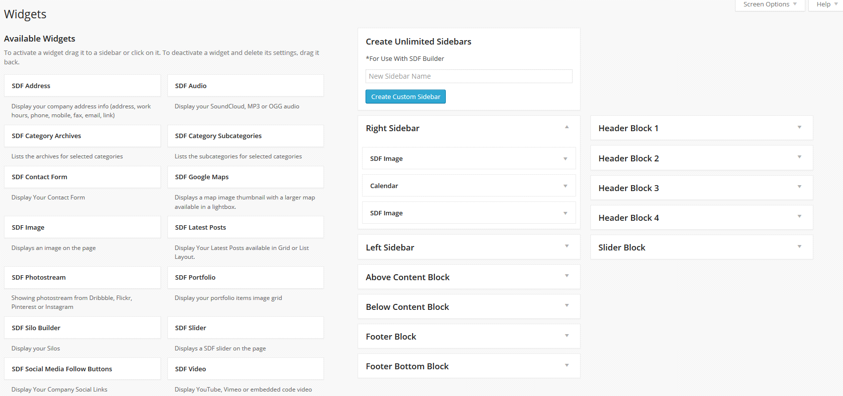
Adding Widgets
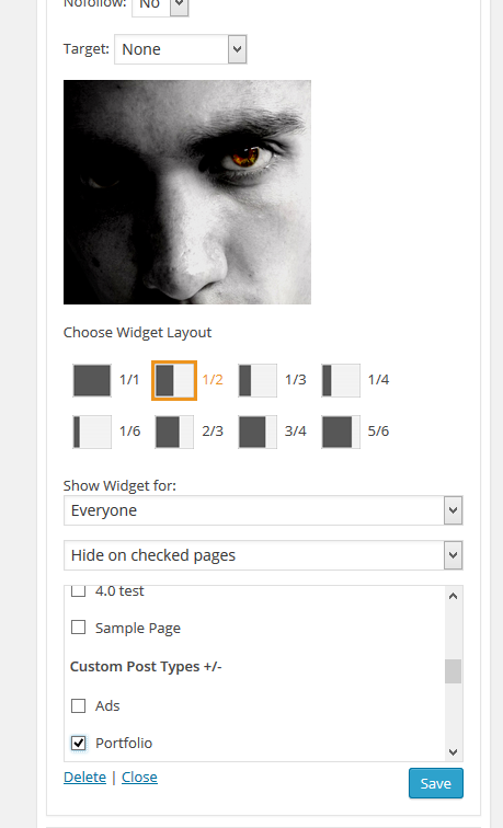
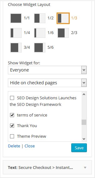
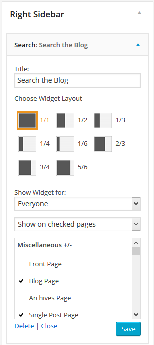
Next >>> you're ready to add and style widgets on your site. The premise is simple 1) stack as many widgets in the static areas as you need and use the widget layout option (ranging from 1/1 for the full width of the area up to a 1/6 width) and 2) determine which widgets show where or are hidden on which pages/posts or categories.
Since the SEO Design Framework has advanced widget functionality, these two features (widget layout and the display widget functionality) are available on ALL widgets.
This means you can stack widgets using 1/1 widget layout option or divide the widget container with additional widgets using the other fractional widget widths to occupy the layout.
You can also determine who sees what widgets ranging from logged in to logged out users, using the hide on checked pages option which allows you to click the pages / posts or categories you want that widget hidden on to using the hide on checked pages option and then not selecting anything (to show the widget on all pages) like a default widget.
Alternatively, you can also use the show on checked pages feature and simply click the pages, posts, categories or conditions you prefer to show / display any widget on.
You can unleash this powerful widget functionality anywhere widgets are used e.g. (in the main Header Widget or Header Widgets 1,2,3 or 4, the Slider Block, the Above Content Widget, the Below Content Widget, the Sidebars, the SDF Builder using Drag and Drop Design and the Footer or in Even in Unlimited Custom Widget Areas you can Create Instantly).
And that's it.
Now >>> you're ready to create pages and posts using the SDF Builder and Page Level Controls or style your existing content since your primary Global Settings are now configured.